Pirkka Parhaat
we updated the brand to meet modern standards and brought quality back to the Finnish dining tables.

Insight
Brand identity had fallen out of date
With Pirkka Parhaat, Kesko ensures that raw materials and good food is available to all Finns. The look of the product range was a bit old-fashioned and it did not represent the high quality of the products – the brand had to be refreshed.
Idea
Design needs to match quality
We decided to communicate the high quality through a simple design. By changing the look clearly to black and white, we managed to create a visual distance to the traditional red Pirkka packaging. In the new look, alike in the Pirkka Parhaat products, the idea of high quality and easygoingness was now combined.
Implementation
A flexible design system
We implemented the creative idea to the basic elements of the look – we updated the logo, typography, composition and the visual scheme. The shape of the Pirkka logo gave an idea for the wavy line, which now appears on the packaging next to the informative label. To manage the whole, we introduced a flexible Design Systems tool that allows variation between different product groups, but keeps the whole entity recognizable.
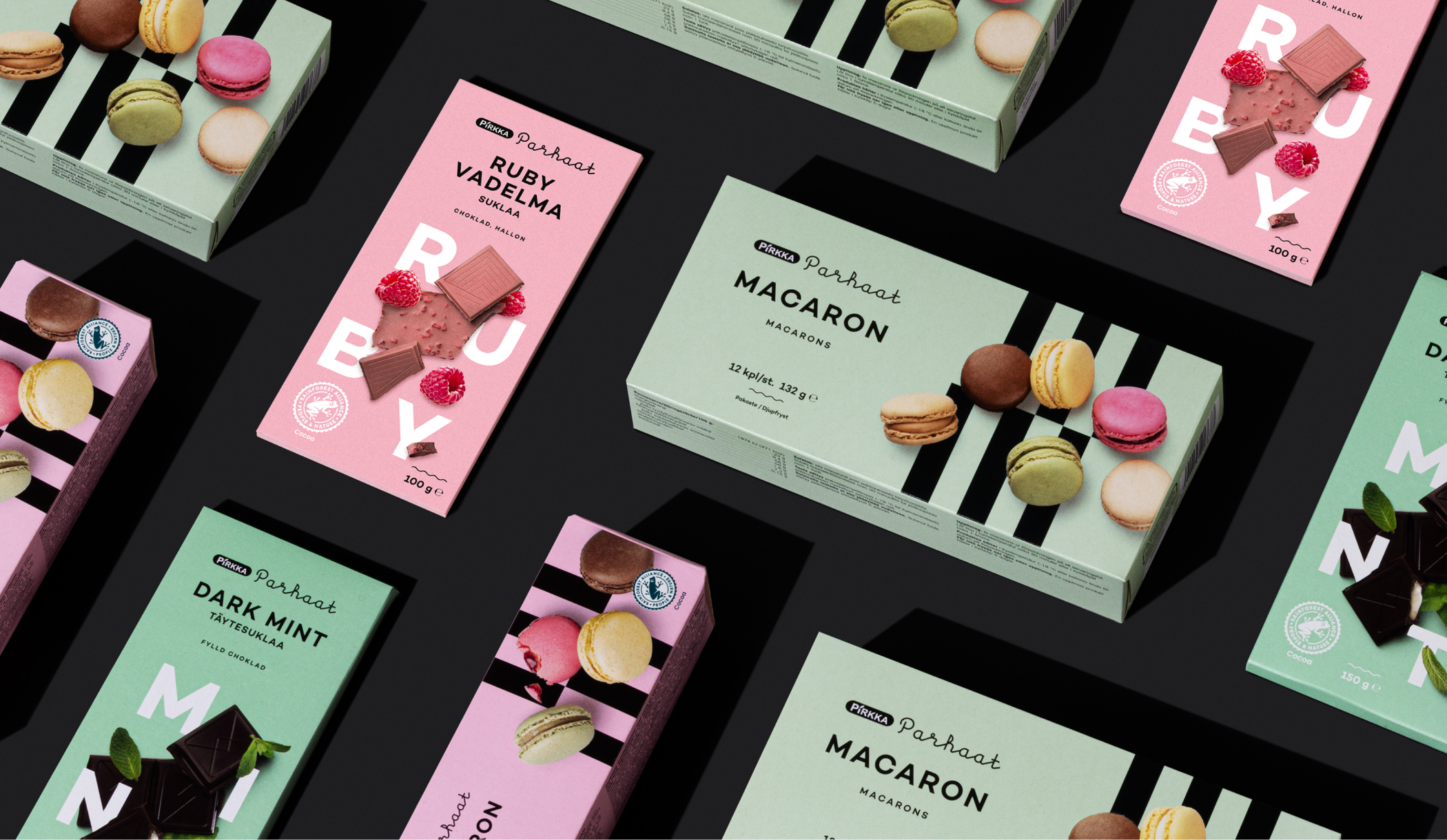
The products were divided into basic and gourmet products. Most of the products belong to the basic line, where the dominant element is a black background and classic centralized typography. We allowed the use of different base color for gourmet products, as well as playing around with the idea of combining different graphic elements and photos.
The products were divided into basic and gourmet products. Most of the products belong to the basic line, where the dominant element is a black background and classic centralized typography. We allowed the use of different base color for gourmet products, as well as playing around with the idea of combining different graphic elements and photos.
Impact
17 x Faster growth in sales
Identity renewal became a success in retail. In the end, sales grew 17 x faster with this renewed identity.